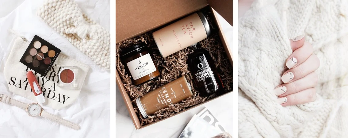
How to flat lay like a pro
We chatted with some of our favorite flat lay experts to round up the best tips on how to master this photo trend like a pro.
Simple Background
“Choosing a background, it’s best way to keep things simple. A plain white background works well because it won’t distract from your props.” - Chatsaran, @thegraybasic
Good Lighting
“Good lighting is key for any photography style, but even more so for flat lays. You want the light evenly distributed across the entire picture.” - Anastasia, @glamorable
“This one will make or break the flatlay. I don't even bother trying to create a flat lay photo if there is no natural light. Personally, I feel that artificial lighting can be harsh, especially with shadows and such in an overhead shot. So, plan out your flatlays right next to some windows to get that natural light for the shot!” - Areta, @aretastylesecrets
Add Depth
“Depth can look like holding one thing above the rest or using a stand to set something up higher. It can also look like peering through leaves above to focus on the product below. - Emily, @oakandoats
“Creating distance between you and the flat lay will help you fit everything into the shot nicely.” - Chatsaran, @thegraybasic
Incorporate Layers
“Layers refers to the textures you add to the image - maybe you place a napkin on the wood table with your cutting board and finally the cheese plate. Playing around with the camera angle can give your photo new meaning, instead of a traditional flat lay from directly above, come at your setup from the side.” - Emily, @oakandoats
Implement a Color Palette
“Flat lays always look better when the items are somehow tied together by color or a theme, so the image looks cohesive.” - Anastasia, @glamorable
Add Props
“Adding extras to make your story more lived in. Take a bite out of a cookie, leave a baker’s mess around your pie, open up the product, or add your hands. Little things like this make a flatlay personal and encourage follower to see how the products can fit into their lives!” - Emily, @oakandoats
“I always make sure that my flatlays tell some sort of story. For example, my most recent flatlay style post was for Darphin and their campaign focus was about feeling as though you ‘Woke Up in Paris’. So, I made sure to include very quintessential Parisian things like red roses, a Diptyque candle, and an image from a book that had a shot of some Parisian buildings. This way, my audience is really able to connect with the products and understand the overarching theme of the flatlay.” - Areta, @aretastylesecrets
Rule of Thirds
“If you enable the ‘grid’ feature on your phone, you'll see these grid lines come up. I always make sure that whatever is supposed to be the focus of the flatlay falls right on those lines, which is in the ‘thirds’ of the image (proportion-wise). The human eye is naturally drawn to those areas of a photo. Even better, if I can get the product I'm featuring right at the intersection!” - Areta, @aretastylesecrets
Practice, Practice, Practice!
“Test different arrangements. Make sure to take lots of photos to be able to choose the right one.” - Ani, @idees_de_mode


